
hyperverge / ui builder
designing multi-step interactions on a no-code tool

this project explores how complex, event-driven interactions are created in hyperverge’s ui builder. it covers the move from manual json edits to a fully visual, no-code interface — enabling faster setup, fewer errors, and better scalability for clients.
short on time?
catch the highlights with the project slides
impact
~40%
-25%
~21%
about hyperverge
With a dedicated suite of modules for signature verification, selfie verification, income verification and nominee creation Hyperverge aims to improve go-live speed, reducing engineering overhead, and optimise for conversion.
They’re enabled by their products to deliver these experiences.

my role @ hyperverge
at hyperverge, i owned end-to-end design for the company’s workflow and ui builder, driving major improvements in how users create, customize, and deploy onboarding journeys.
i also lead design and research for the end-user experiences delivered through our sdks, to enable seamless, high-conversion, and compliant onboarding + kyc for financial products.
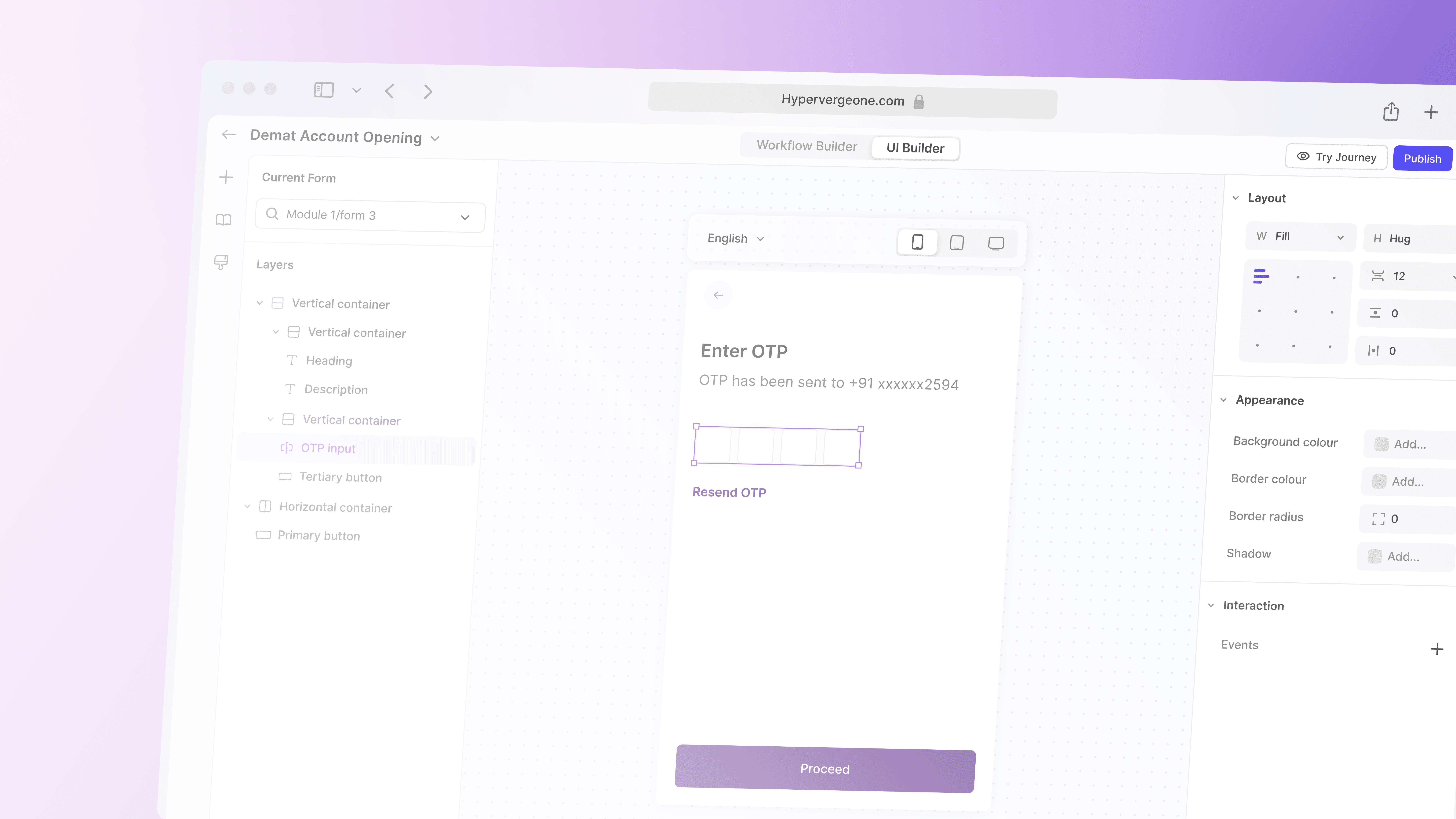
about the builder
our no-code ui + workflow builder lets teams visually create end-to-end onboarding flows with forms, screens, and logic.
It enables faster iteration, less engineering effort, and consistent experiences.
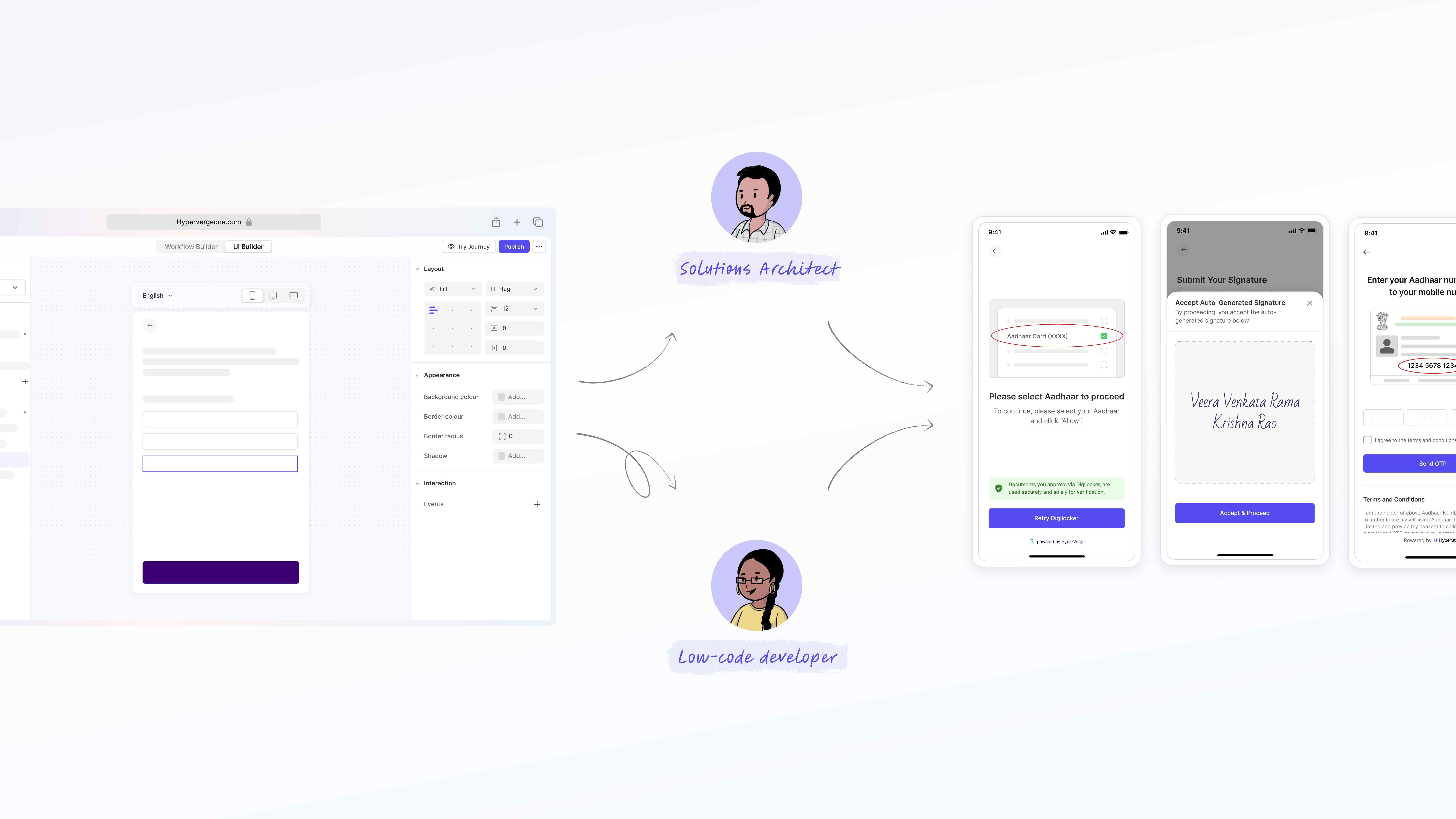
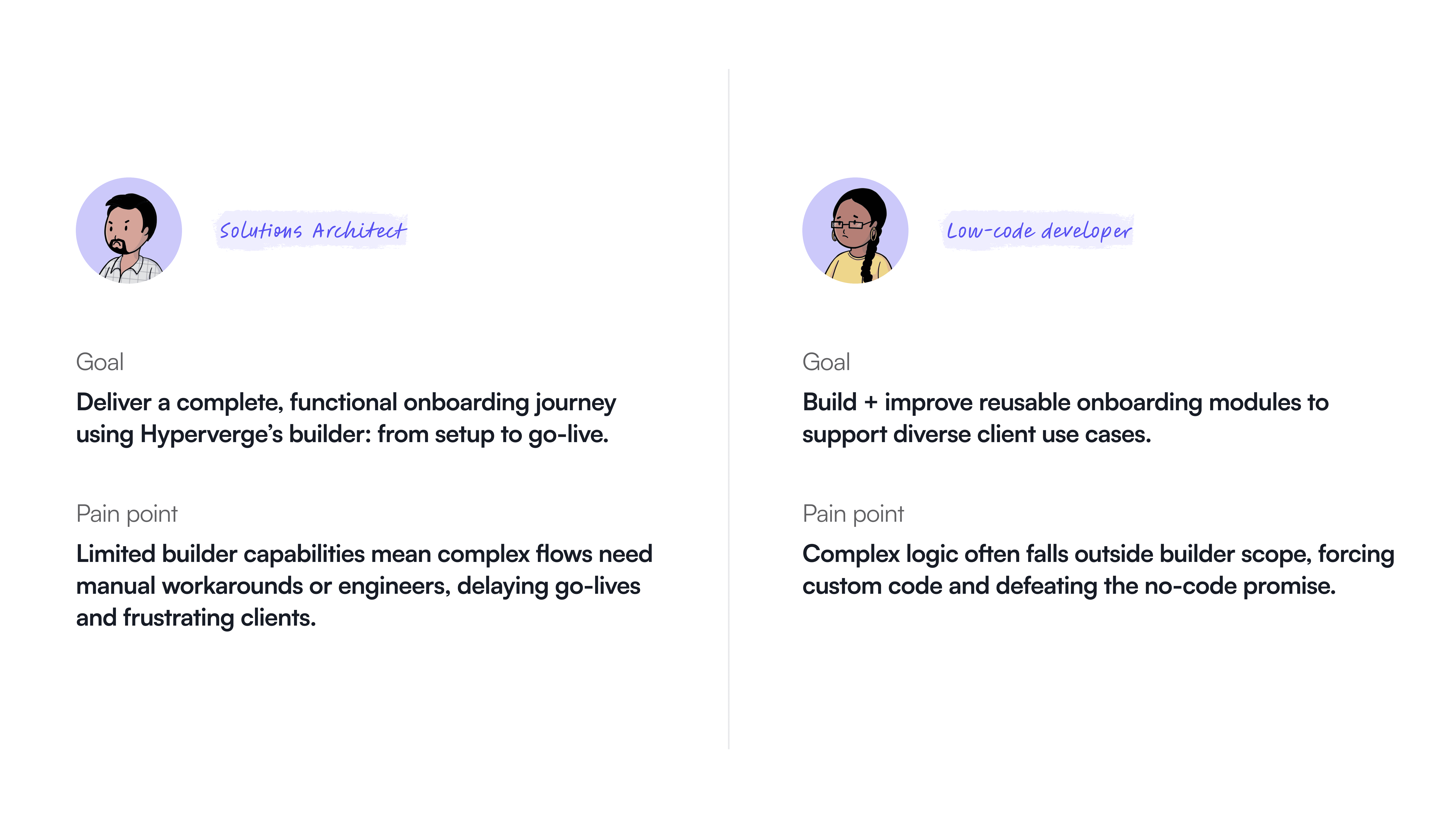
who uses the builder, and how?
solutions architects
their goal is to deliver complete, functional onboarding journeys using hyperverge’s builder, taking them from initial setup to go-live.
low-code devs
their goal is to build and enhance reusable onboarding modules that support a wide range of client use cases.
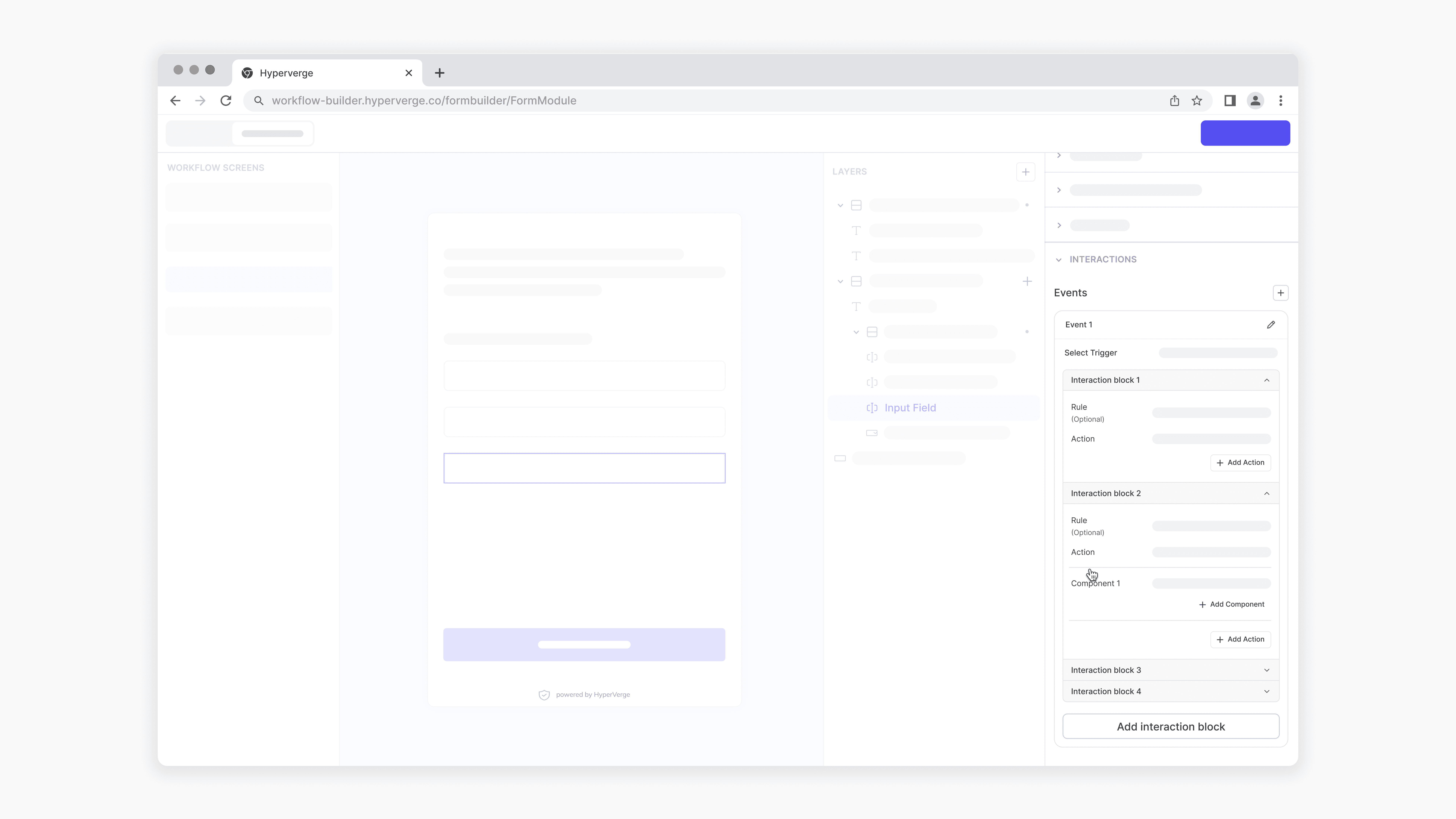
functional, but lacking dynamics
basic events worked, but users expect interactive interfaces that respond and guide in real time.
dynamic experiences like inline validations, toasts, or action sheets weren’t easy to build. So teams often resorted to clunky workarounds like chaining static forms.
failure when met with complexity
the existing builder handles basic trigger–action flows well but breaks down with multi-step, conditional logic.
however when met with complexity, the builder failed to deliver.
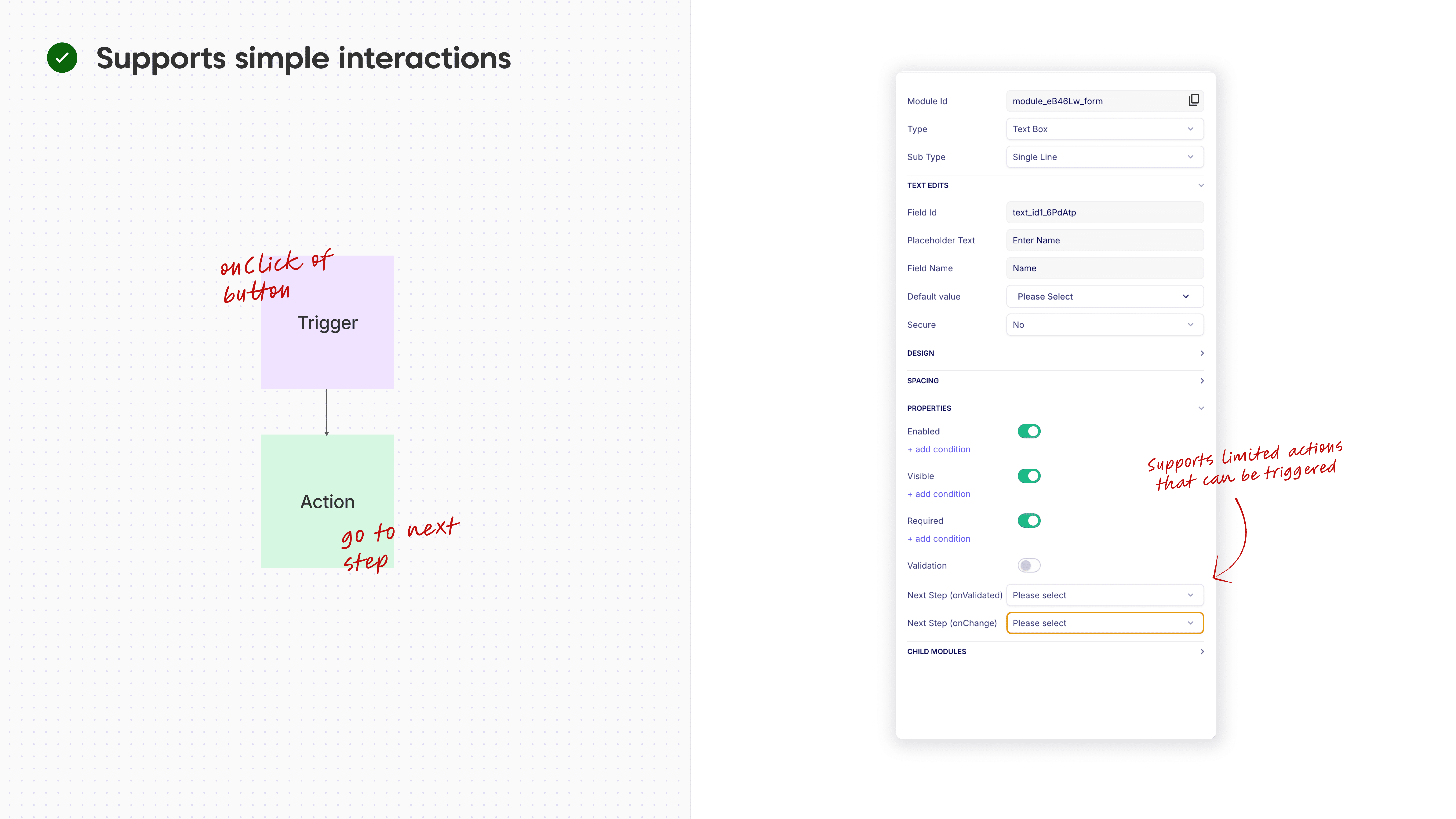
for example, showing a guardian consent sheet only if a user is under a certain age requires writing custom json in a separate editor.
this forces solutions architects and low-code developers to leave the visual builder, increasing effort, risk of errors, and slowing delivery.

impact on users
design objectives
before exploring a solution to these issues, i defined some key objectives our approach should aim to satisfy
empower users to build with clarity through feedback, validation, and easy debugging.
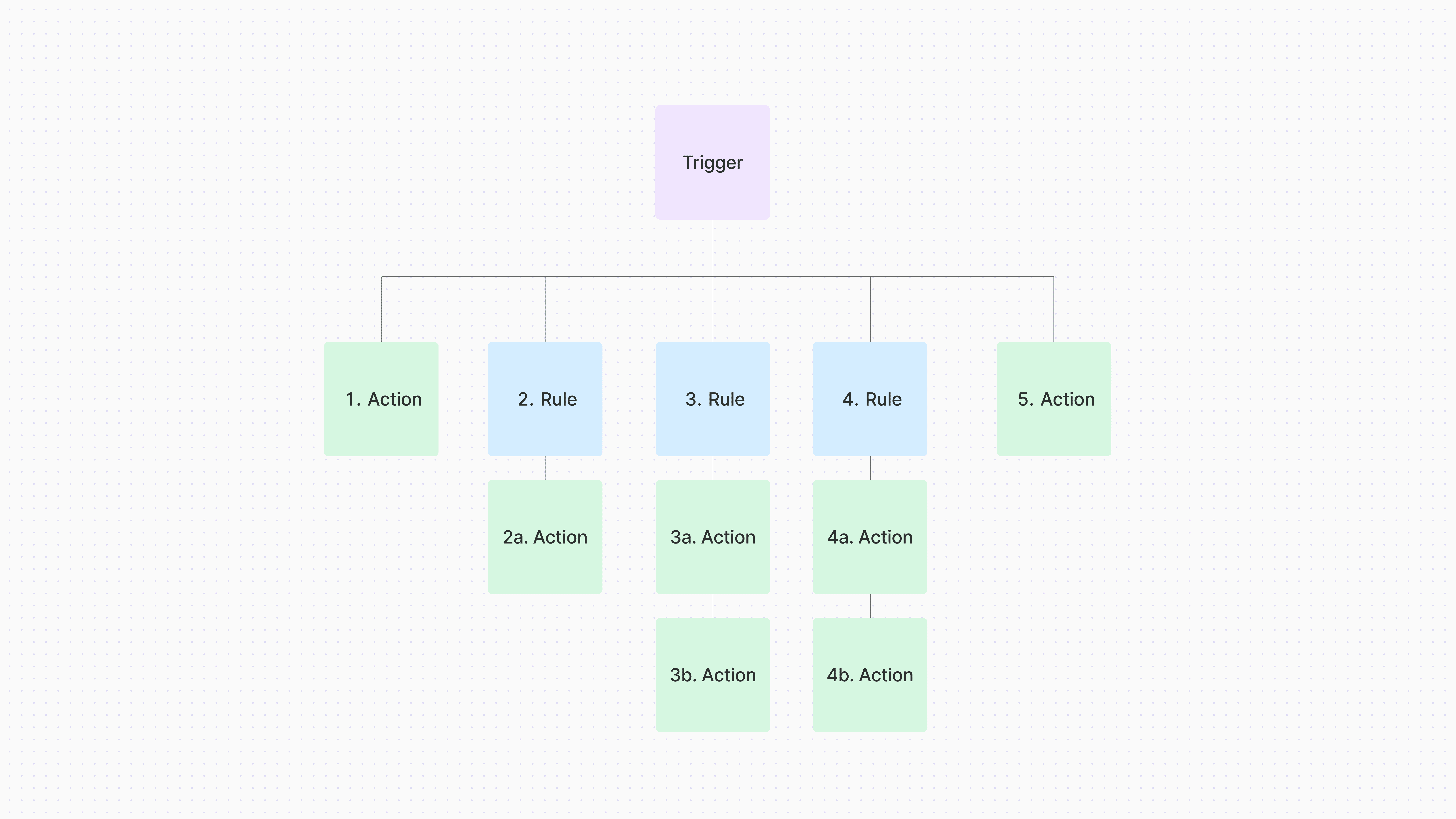
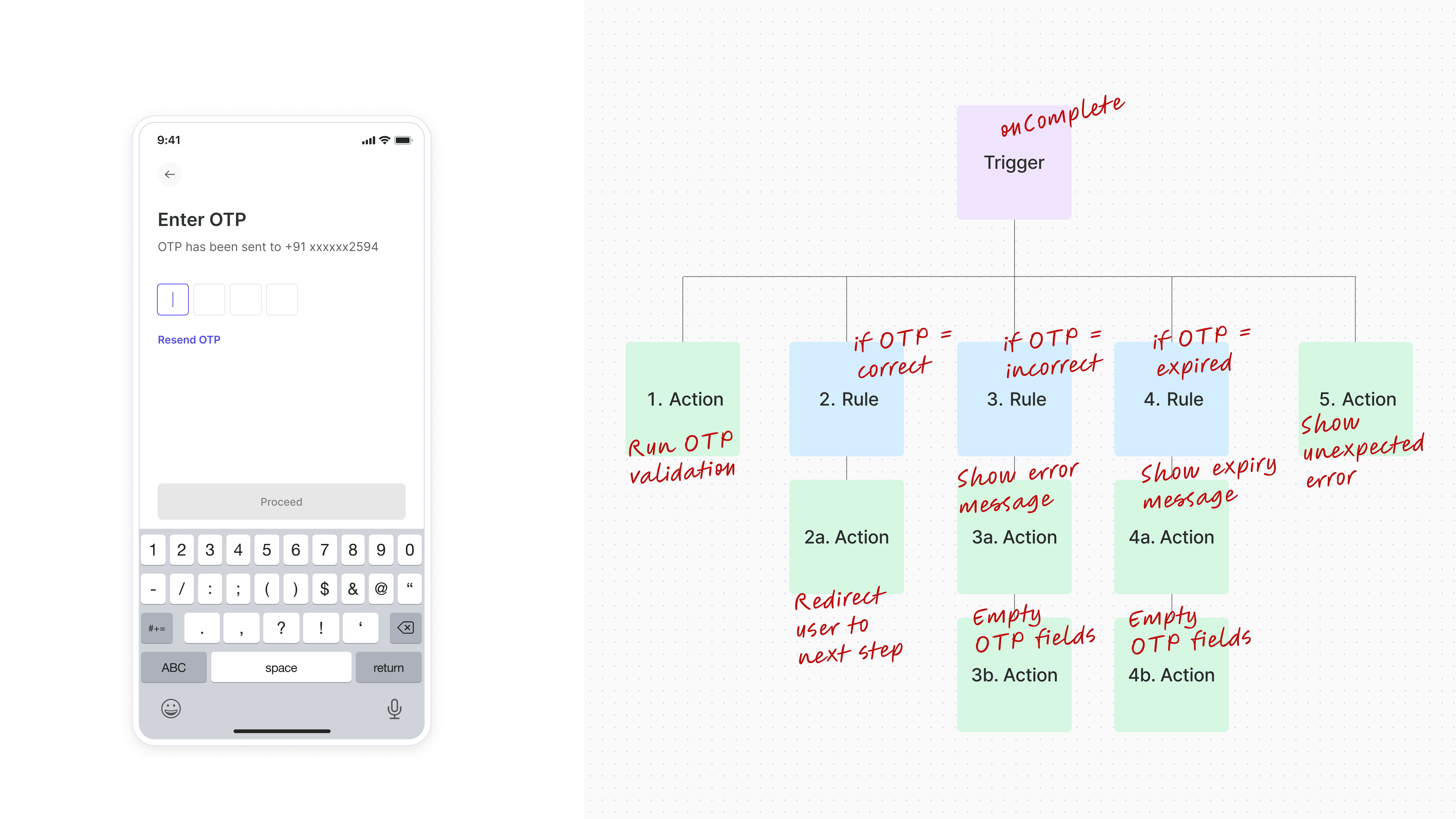
anatomy of an interaction
together with product and engineering, I mapped client asks, UX gaps, and common interactions patterns to define the complexity our builder needs to support.
here’s an example of one of the most common, everyday set of interactions to help you understand how we mapped the structure of interactions
shaping the solution
along with the references for daily interactions we studied across mobile apps, i gathered references from established no-code and low-code tools, studying how they handle complex event flows.
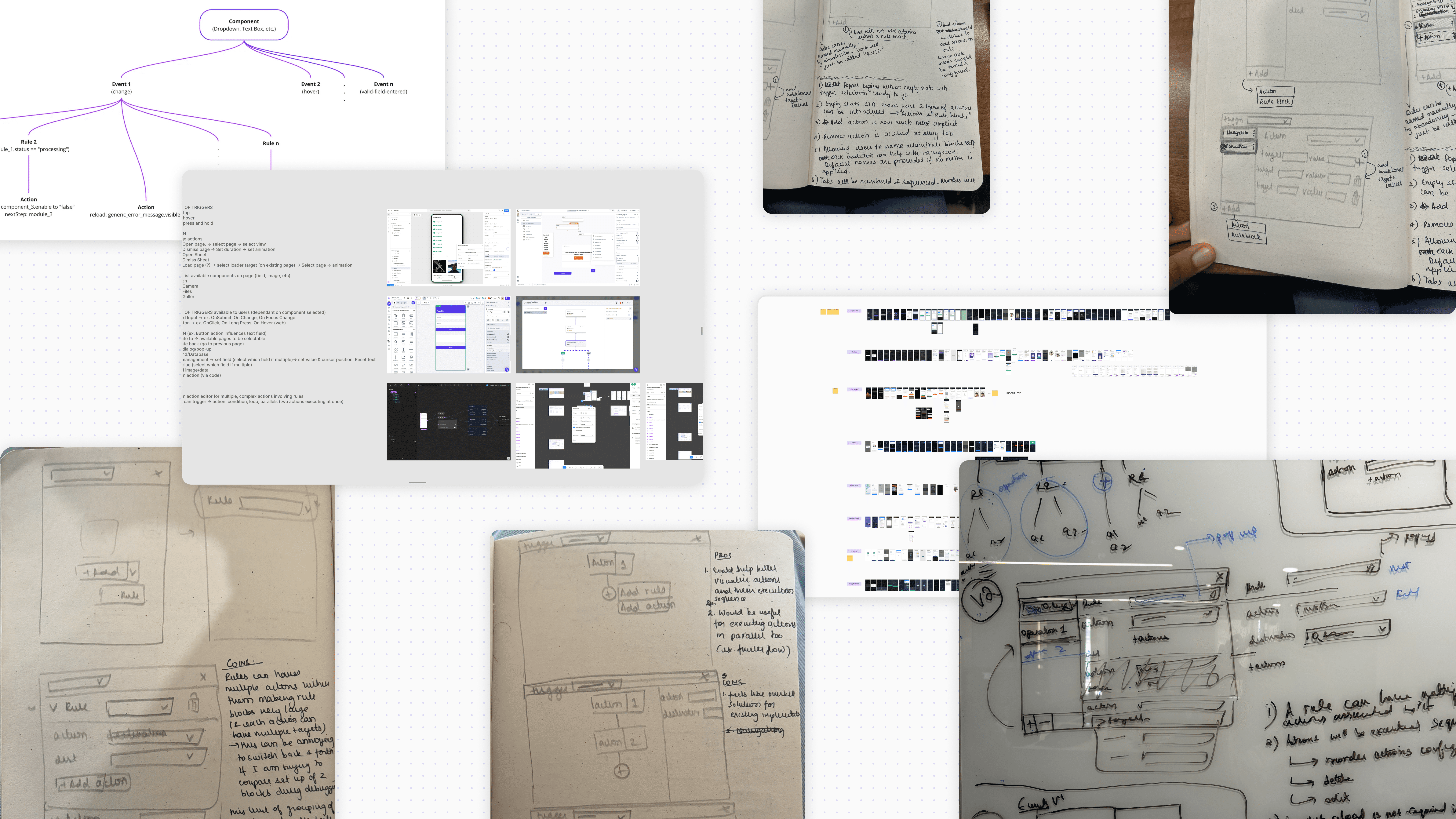
before settling on the final approach, i explored multiple approaches and interaction patterns.
these early concepts were shared with both users and our engineering team to validate usability, alignment with real-world needs, and technical feasibility.
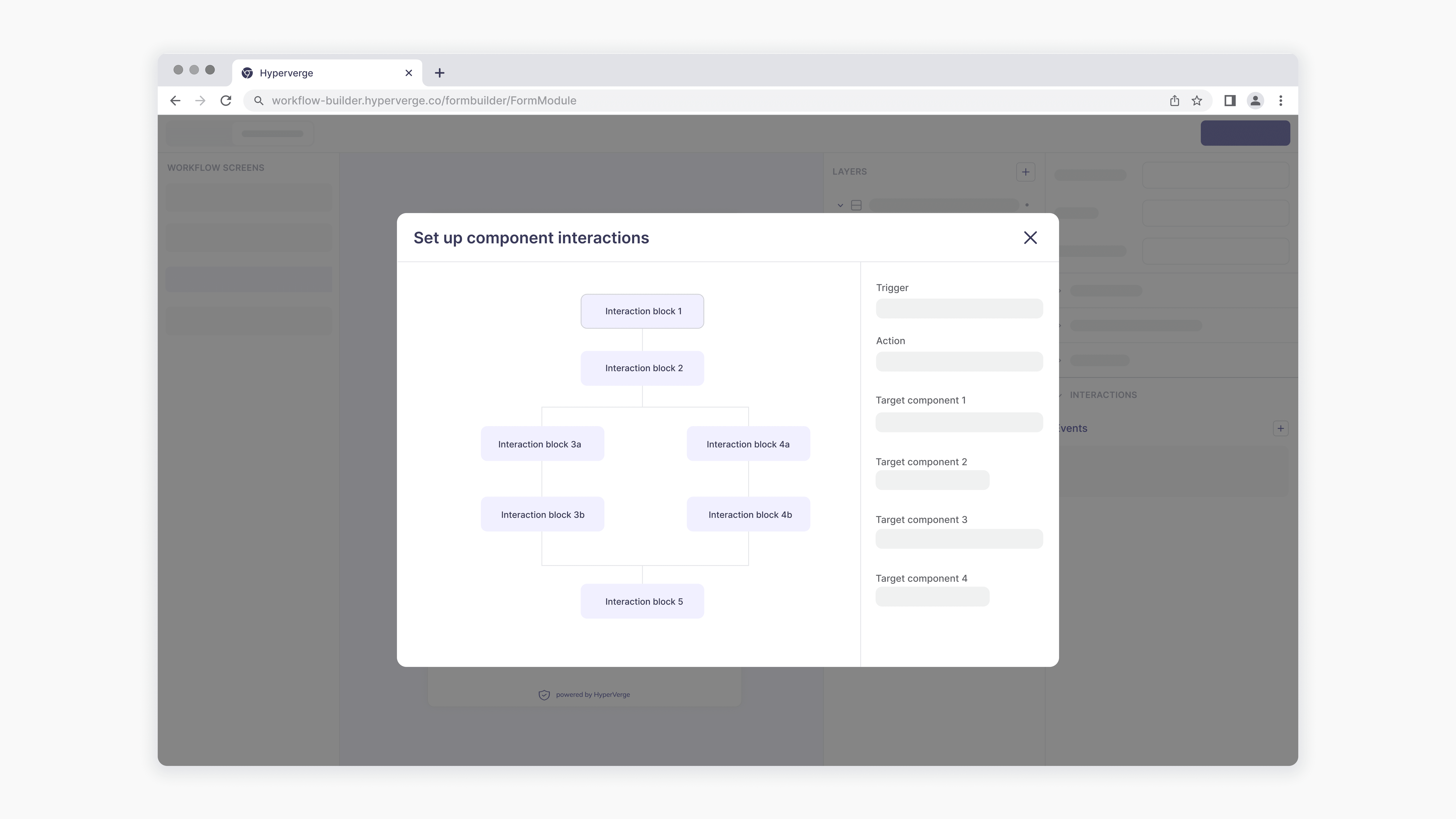
❌ rejected approach 1
one approach explored a linear setup inside the properties panel — but this reduced clarity and made complex configurations overwhelming to create or revisit.
❌ rejected approach 2
another approach explored the linear setup within a popper. While it solved for space and grouped logic contextually, it still made complex configurations hard to navigate and debug.

🤔 a promising approach…
a more promising solution proposed a flowchart-style interaction builder—visually mapping execution paths. While it offered clarity and control, it was phased out due to high implementation complexity and the backend/frontend effort required.
prototyping & testing
once i identified a feasible approach, i built low-fi prototypes to validate the final approach with our solutions architects and low-code devs. this helped assess their response to the experience and overall interaction cost across the flow.
playing with ai for higher fidelity testing
given this was an interaction design heavy project, to bring the refined interaction model to life, I used v0 to build a high-fidelity prototype. with gpt’s help, I crafted a prompt to translate my vision into a working model.
while the output was FAR from perfect, it helped validate changes from earlier iterations, test the flow with users, and communicate interactions with engineers outside of the figma file—saving time downstream.
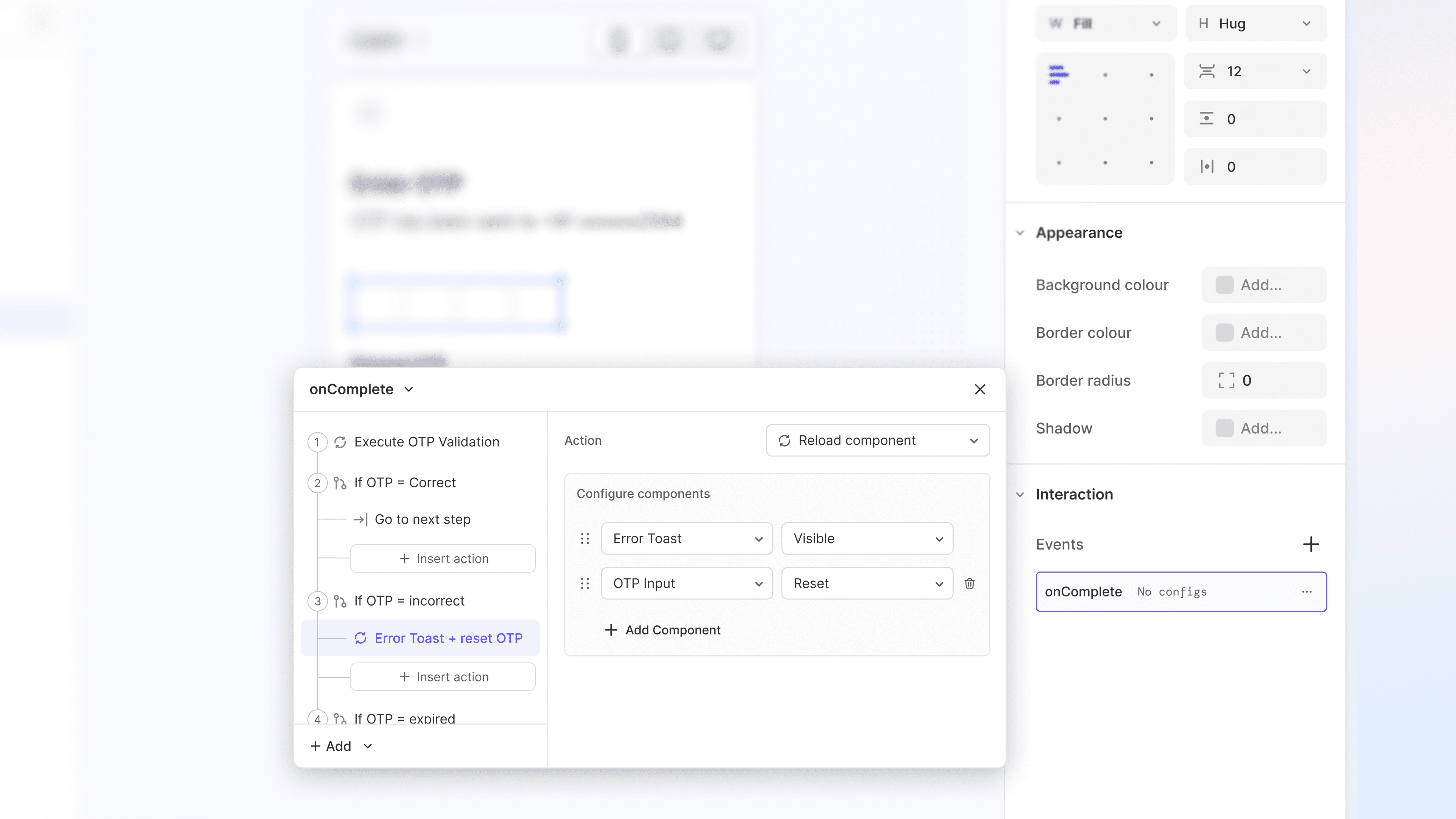
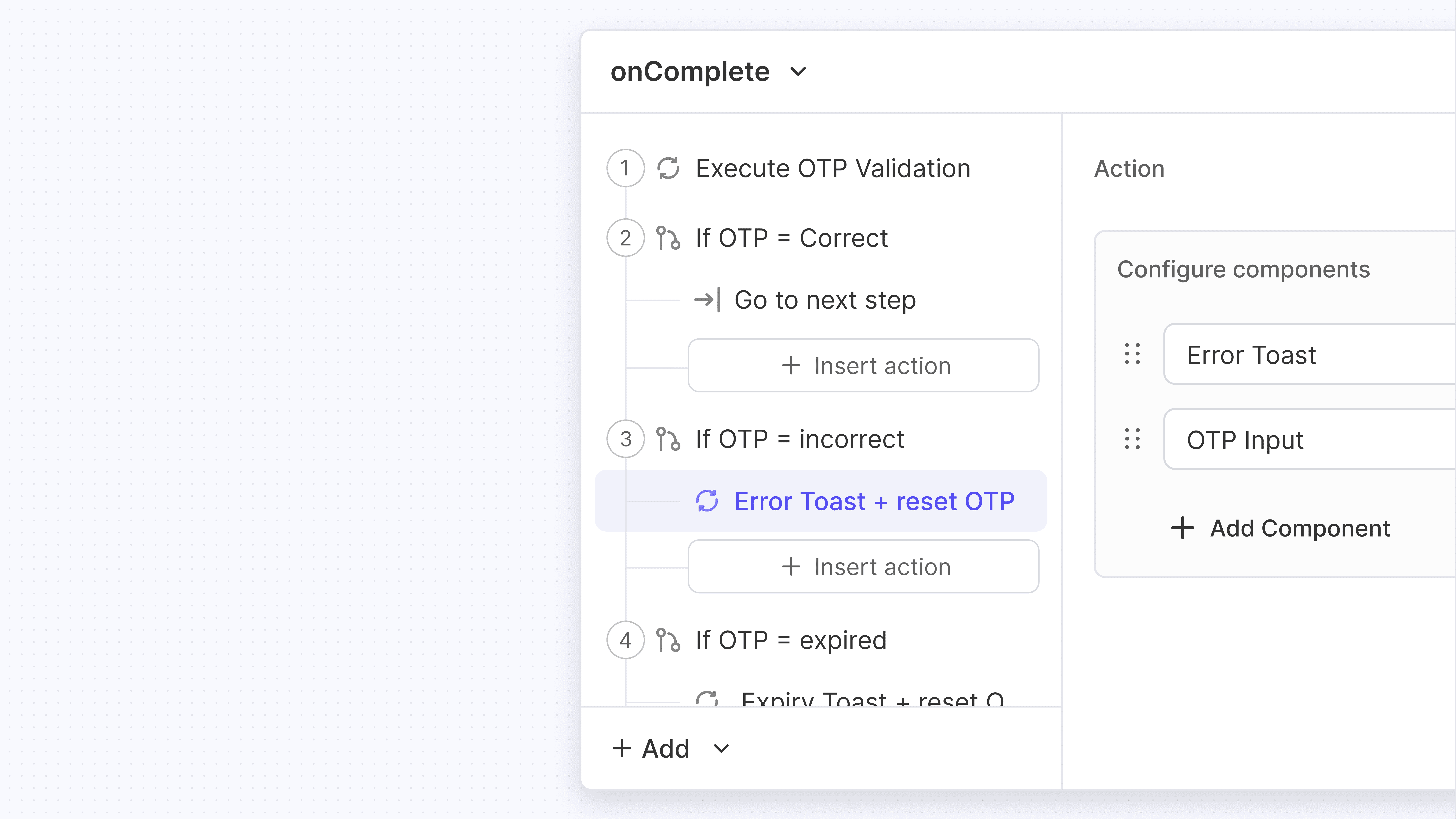
Creating an improved solution
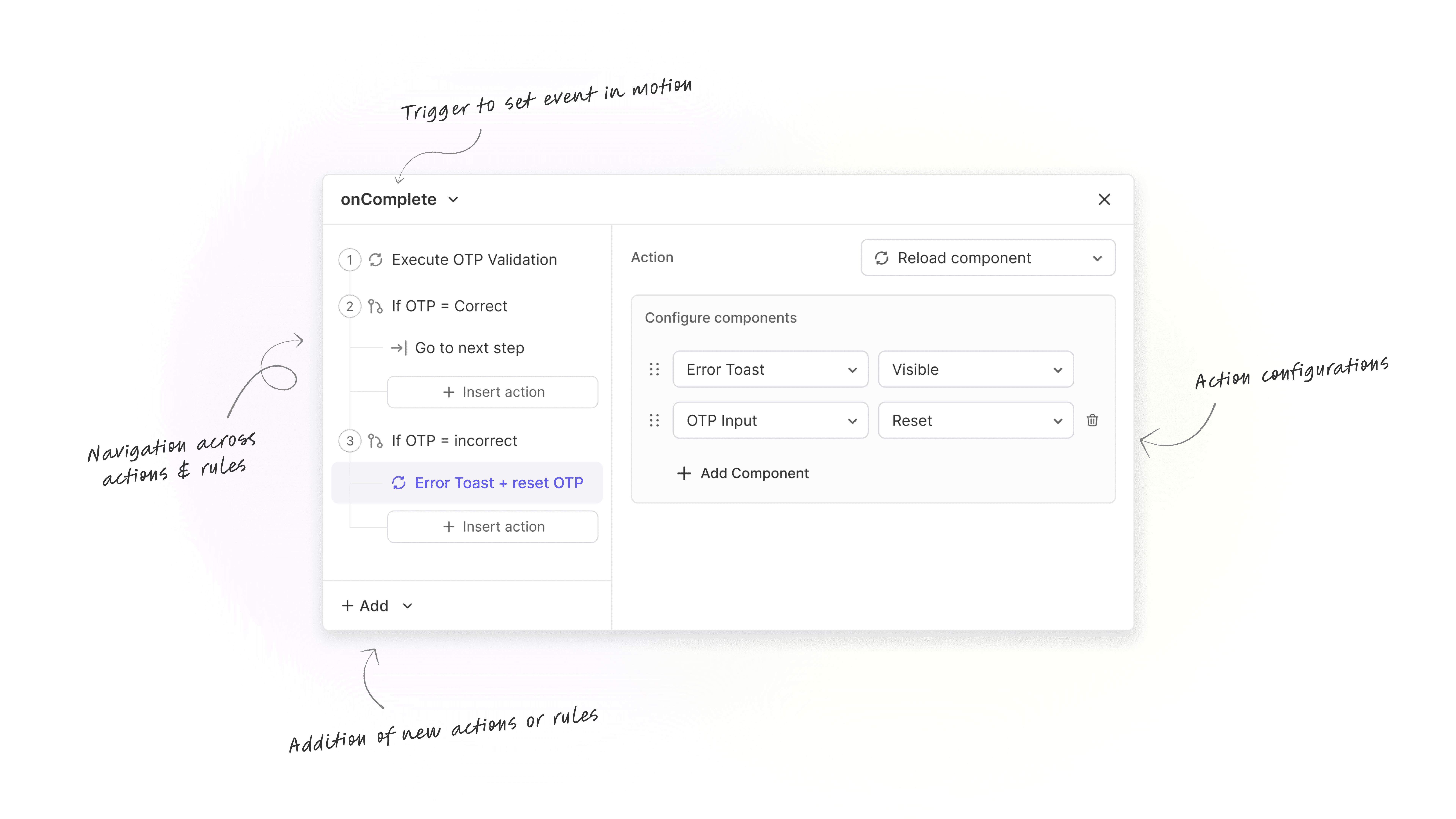
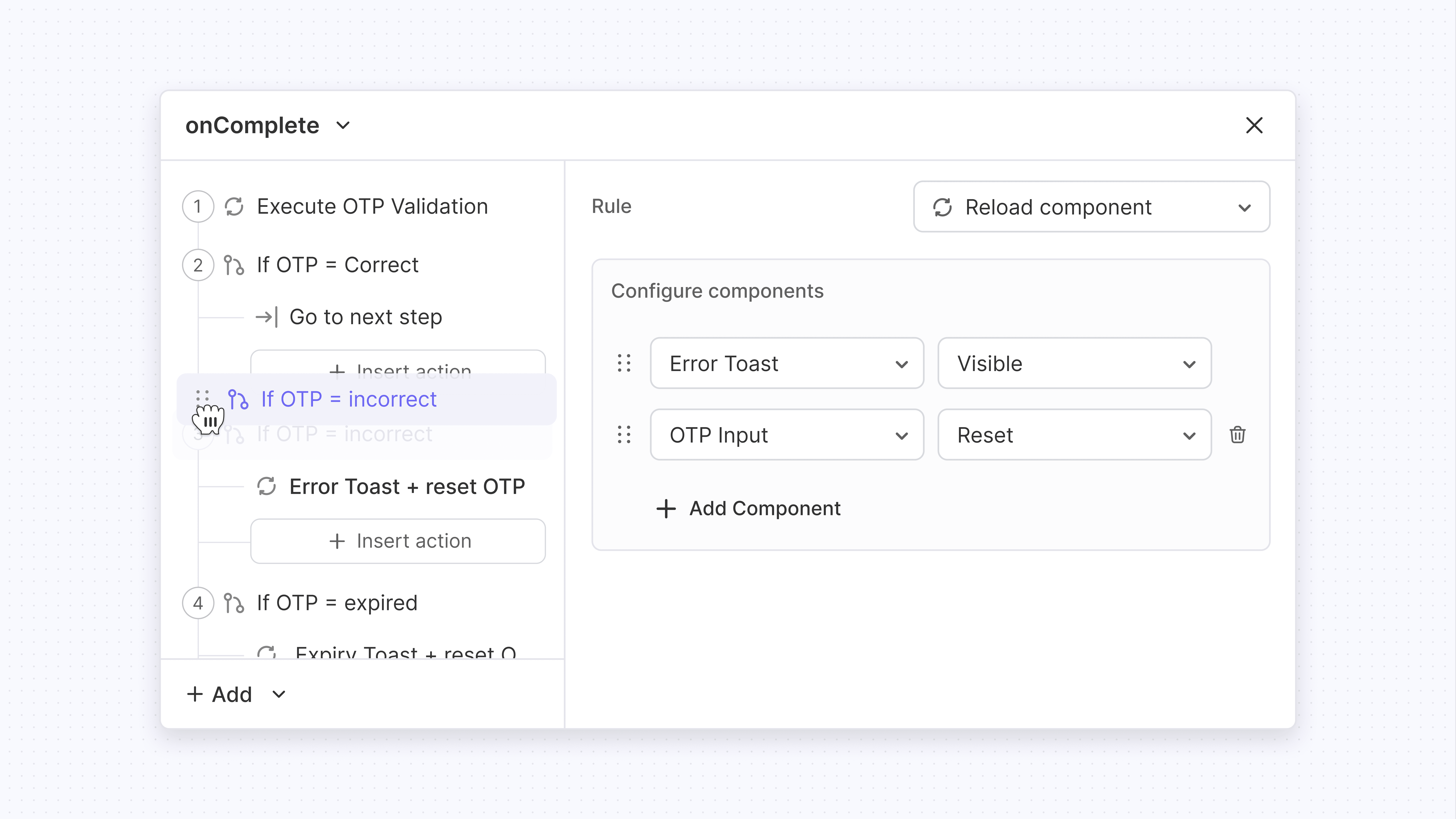
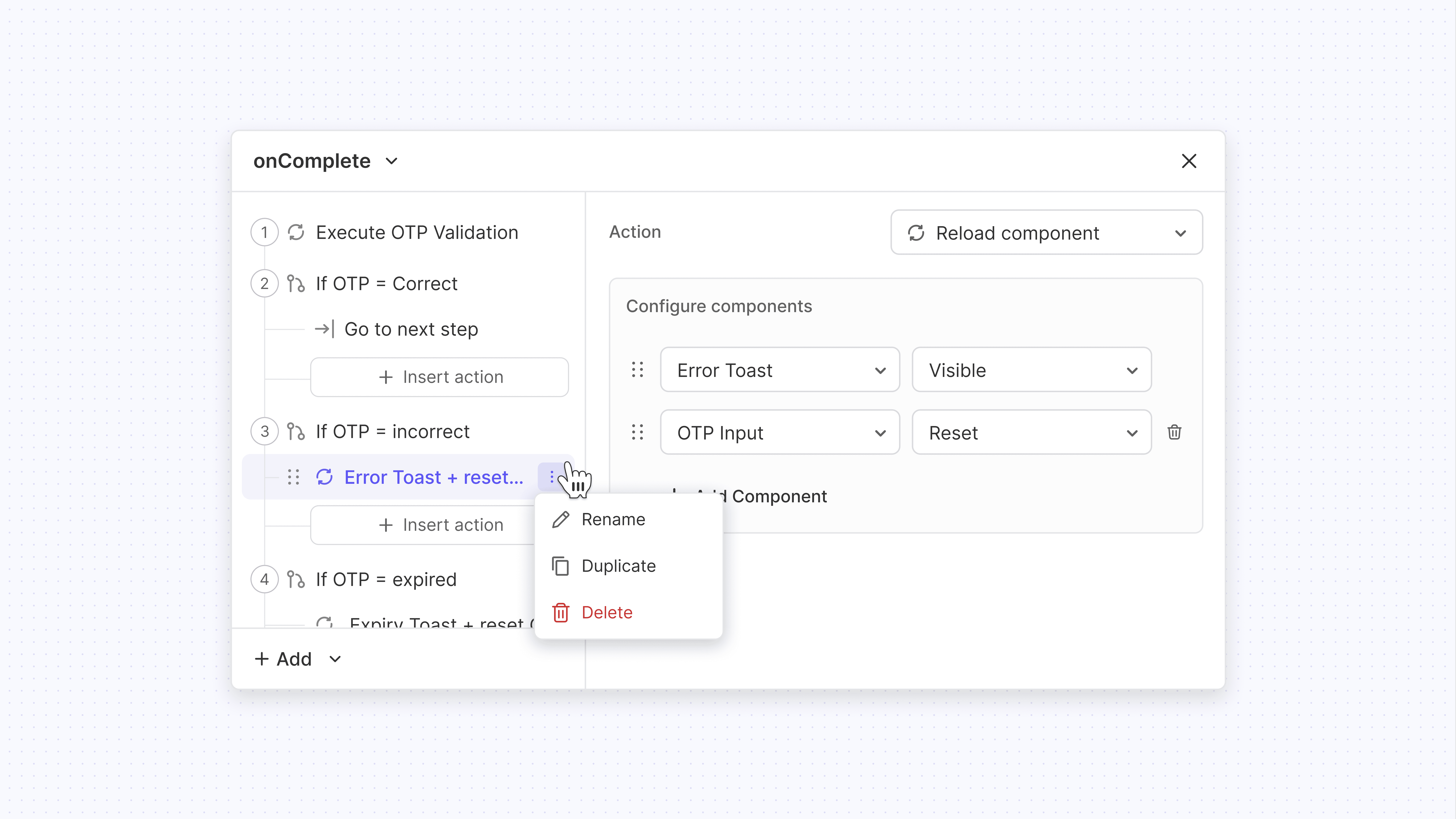
left-panel for navigation
All actions and rule blocks are visible in one view, making it easy to scan, edit, and debug with clarity and minimal friction.
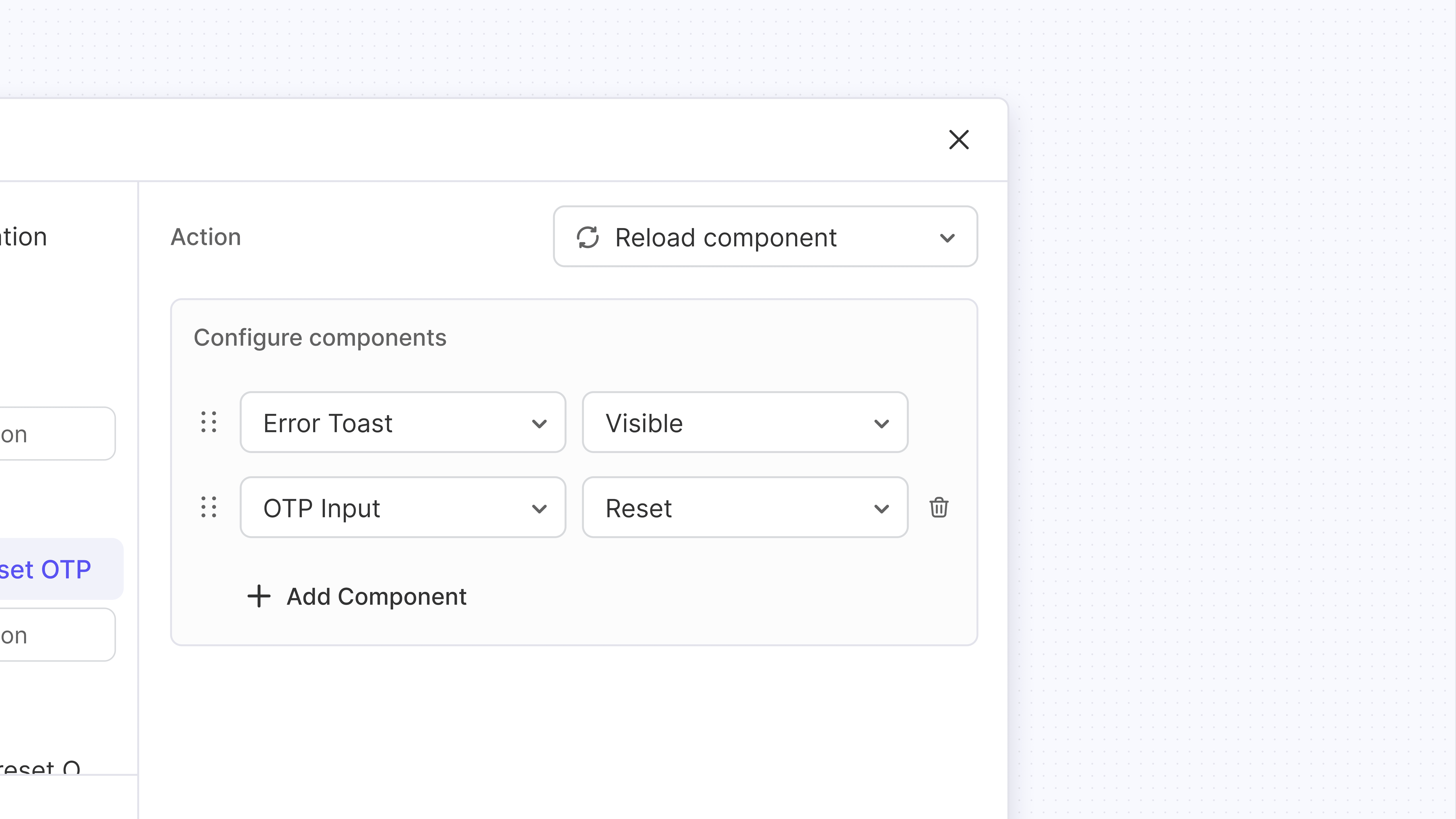
right-panel for configuration
the right panel scales with complexity, letting users configure actions clearly without adding clutter.
drag-and-drop
clear numbering and signifiers to drag-and-drop actions or rule blocks are provided so that sequencing is intuitive and accurate.
CRUD actions
users can add new actions or rule-blocks & rename, duplicate or delete them to simplify navigation, enable reuse, and support fast debugging.
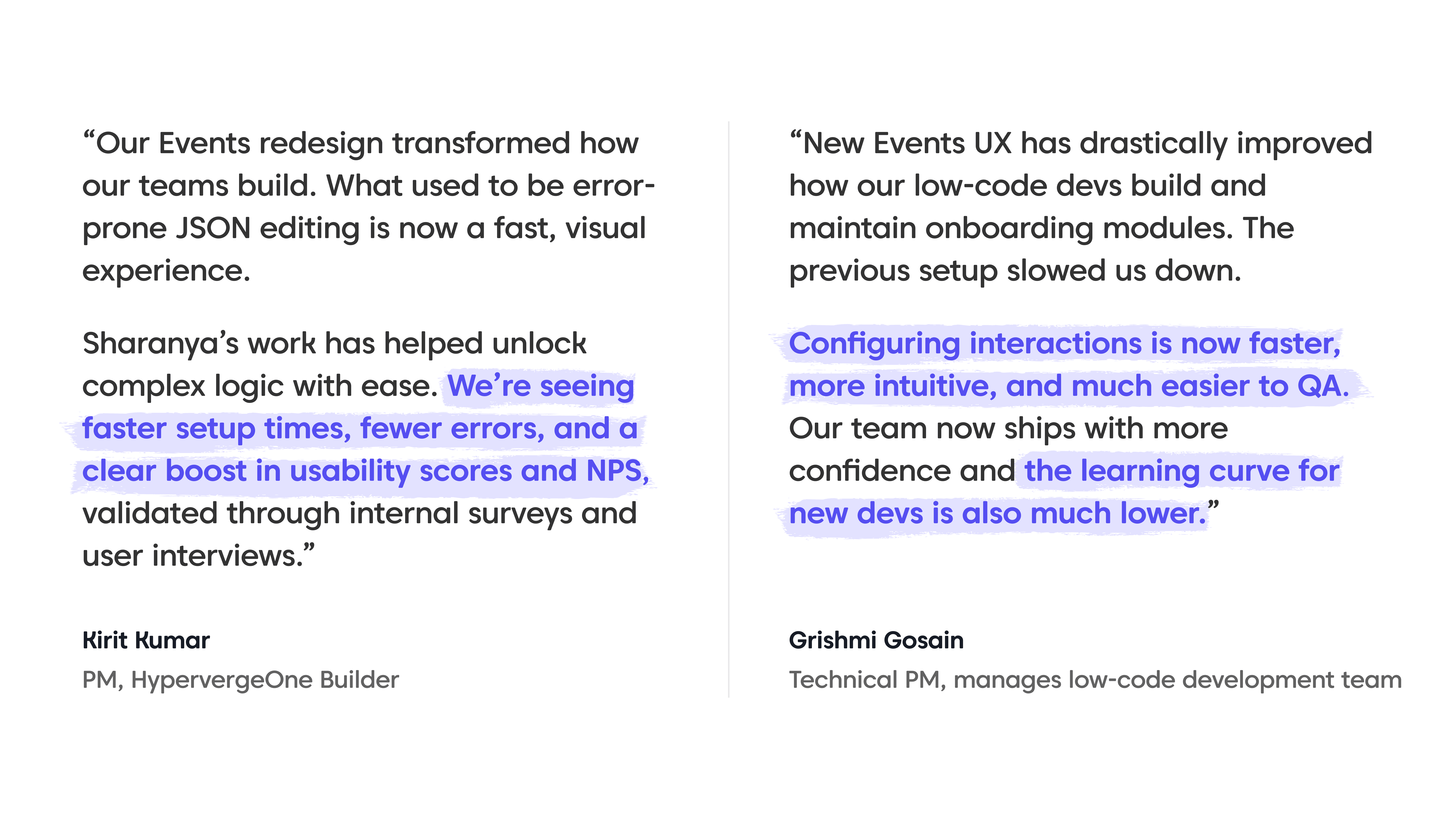
impact & feedback
faster setup and debugging reduced average interaction setup time by ~40%, helping clients ship onboarding journeys quicker.
no-code error handling cut developer intervention requests by 25%, freeing up dev bandwidth and improving build reliability.
cleaner ux drove a ~21% increase in builder adoption, making interaction setup more accessible to non-technical users.
better end-user flows translated these gains into stronger client outcomes and higher satisfaction.
reflections & future scope
Deep-diving into event logic helped craft a no-code solution with dev-level flexibility. Researching and shaping this was incredibly rewarding.
Cross-team collaboration enabled us to come up the best solution given available resources. We’re still monitoring for edge cases and future simplification.


